Video Tutorial
Prerequisites
::: tip
In this tutorial, we assume you have:
- Speckle Account (you can get one for free🎉 at https://speckle.xyz/)
- 🔵 Revit Connector (install it via Manager)
- 🟡 Power BI Connector (installed from Github)
- 👁️ 3D Viewer Visual for Power BI (installed from Github)
:::
Send the Revit Model to Speckle
Let’s start by sending the Revit model into Speckle.
- Open Revit and activate the Speckle connector.
- Create a new project and model or select an existing one.
- Use the "Send" option to upload the model to Speckle.
Receive the Revit Data in Power BI
Now, we have our data in Speckle, let’s receive it in Power BI. Here’s how:
- Open Power BI and go to "Get Data."
- Search for "Speckle" and select the default connector.
- Paste the model's URL and click OK to retrieve the data.
Filtering Rooms
Since we are going to deal with Rooms, let’s filter them out. In the Power Query Editor, filter the data by selecting the "Objects.BuiltElements.Rooms" speckle type. We already shared alternative ways of accessing categories, so you can use those as well. Here is that tutorial:
[Bookmark here]
Extract Room Parameters
Let’s extract some parameters from the Revit Rooms. We already have a separate tutorial on different ways you can extract parameters from received Revit elements.
[Bookmark here]
- Add a new column and name it as parameters.
- In the formula section, use
Speckle.Revit.Parameter.ToNameValueRecord([data][parameters])as the formula. This will convert complex Revit parameters into much more readable key-value pairs. - Expand desired fields from the newly created parameters record.
::: tip TIP💡
Make sure the data type of columns are correct. For example, data type of Room Areas should be Decimal, numbers should be Number etc.
:::
Visualize Rooms in 3D
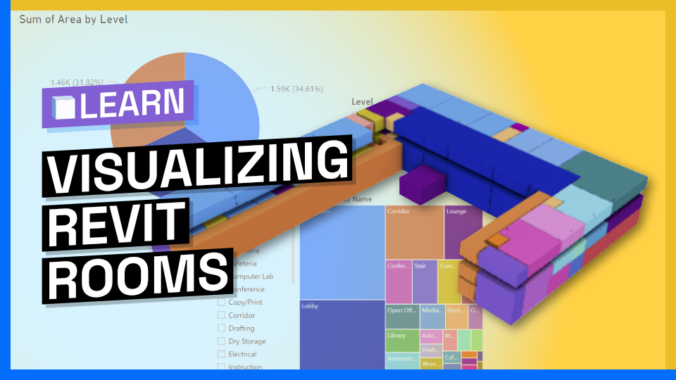
Let’s view our data using 3D Viewer Visual. You can do so by adding a 3D Viewer Visual into the dashboard and and configure it with the appropriate stream URL, commit object ID, and object IDs.
Adding Other Visuals
Once you are done with filtering and extracting of data, you can use other Power BI visuals too. In this tutorial I used
- Pie Charts: After filtering the room elements, we added a pie chart visual to showcase room areas by level. This visualization allows us to easily compare the distribution of room areas across different levels.
- Treemaps: We included a treemap visual to display the room areas categorized by room names. The "Area" column was assigned to the values, and the "Name" column was assigned to the category of the treemap. This visualization provides a hierarchical view of room areas based on their names, allowing for easy identification of patterns and comparisons.
- Slicers: A slicer visual was added to provide interactive filtering options for the rooms. We dragged and dropped the "Name" column into the slicer visual, enabling us to filter and select specific room names. By using the slicer, we can quickly narrow down our focus and analyze specific rooms or groups of rooms.
Troubleshoot: Aligning Colors Across Visuals
When highlighting elements in the 3D Viewer visual based on a specific attribute (e.g., room names), we noticed that the colors in the 3D Viewer visual did not match the colors in other visuals (e.g., treemap).This occurred because the sorting order in the 3D Viewer visual was based on room names, while the other visuals were colored based on a different attribute (e.g., sum of area).
[Bookmark here]
To fix the color mismatch:
- Within the format options, we located the "Sort by" parameter, which was initially set to "Name."
- We replaced the "Name" sorting with the attribute we wanted to match, which in this case was the "Sum of Area."
- To activate the color update in the 3D Viewer visual, we needed to reset the visual.
- We accomplished this by selecting the 3D Viewer visual, using the "Ctrl+X" keyboard shortcut to cut it, and then pasting it back into the dashboard.
- After the reset, the colors in the 3D Viewer visual aligned with the colors in the other visuals, resolving the color mismatch issue.
Conclusion
By leveraging the Power BI Data Connector, we successfully visualized Revit room data. We filtered the data, extracted parameters, and created visualizations of the room elements. We also addressed possible issues related to visual consistency. This tutorial provides a solid foundation for harnessing the power of Revit data visualization in Power BI.
If you have any questions, feel free to ask them at speckle.community.
Try this tutorial, let us know what you think!


